The 2023 Color of the Year Real Estate Tips

The 2023 Color of the Year Real Estate Tips
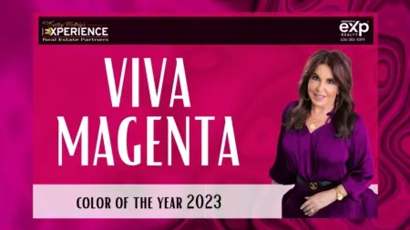
Recently, Pantone revealed its Color of the Year for 2023. And for the third time in seven years, the color has a purple-like quality to it.
Viva Magenta is the newest trending color! The color is more pink-leaning than its purplish ancestors (such as Very Perri from last year and Ultra Violet from this year), but it's still a powerful plum that draws in both red and blue tones.
So why is this color suddenly making a reappearance in high-end interiors when it was previously only used in children's toys and velvet maxi skirts? Here are some suggestions for using purple in decor.
What makes purple so unique?
It's important to understand why plum is having such a moment before we go too plum-crazy. A theory? It enables us to connect with our inner kings and queens.
Purple is regarded as intriguing and enigmatic because it is an uncommon hue in nature. So much so that in ancient times, purple was designated as the color of royalty. It stood for power and money.
Beyond the mysterious and opulent qualities of purple, crimson and blue, the vibrant color's parents deserve appreciation. Because they are all mixtures of the extreme ends of the optical spectrum of blue and red, purple and its variations have lasted for so long. When used in home decor, purple may give a space a cold or warm feel—often both at once. Purples can be employed to great effect in defining a room's character because they are also quite mood-evoking.
Use purple to indicate expansive areas.
Pilasters and recesses can be best defined with eggplant, plums, and aubergines. Additionally, they perform a better job than grays and whites at highlighting the size of a room. We advise employing a shade on "one or maybe two walls at most" and selecting one that is either very light or very dark.
Do: Combine purple with more modest decor components.
You might include purple in your home's design in addition to employing different tones of color to draw attention to structural aspects. For those who want a more restrained use of color, search for artwork that features lavender-themed pastels or some lavender-hued throw cushions on a plush white sofa.
How to prevent being overly purple
Even though it can be tempting to go all out with purple, there are occasions when it is best to steer clear of it or at least scale it back a bit.
Don't: Combine too many reddish colors with purple.
Large applications of this color should be avoided because they can overwhelm the room and lose their favorable psychological effects. Too many purples and reds together can make your eyes tired.
Don't: Make your main living area overly purple.
Another approach to reducing your consumption of purple? In regions where you won't be spending all of your time, take advantage of the vivid shadow. For instance, Goldstein advises against using purple in rooms with a lot of activity or energy, such as kitchens and living rooms.
Instead, only incorporate one or two little design components with the color in such spots. We decided to utilize it in a small powder area to prevent purple overstimulation for our clients," adds Esmond. "The huge wallpaper pattern and the strong purple gave the powder room the appearance of being larger. Purple can also be used to highlight a minor accent wall or piece of furniture.
Categories
Recent Posts


"My job is to find and attract mastery-based agents to the office, protect the culture, and make sure everyone is happy! "
propertyinfo@experience-re.com
146 Chesterfield Valley Dr, Chesterfield, Missouri, 63005, United States
